Analyze frequent values
This page describes how to use the Frequent Values chart. The chart is a histogram that shows the number of rows containing each value of a feature and the percentage of rows for each value of the target.
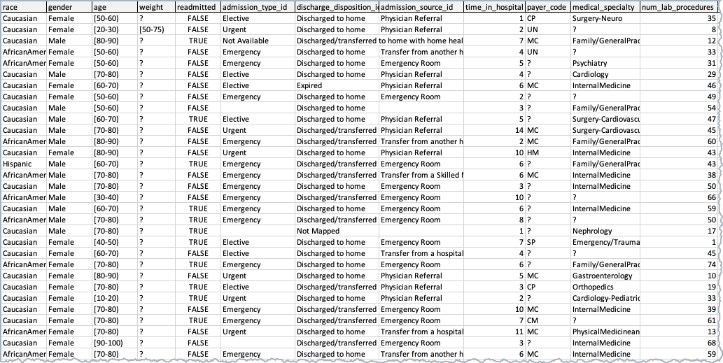
The sample dataset illustrated below contains patient data. With a goal to predict the likelihood of a patient's readmission to the hospital, use the target feature is readmitted.
Overview
The Frequent Values chart is the default display for categorical, text, and boolean features, although it is also available to other feature types. The display is dependent on the results of the data quality check. With no data quality issues:
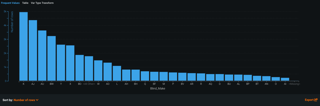
In many cases, you can change the display using the Sort by dropdown. By default, DataRobot sorts by frequency (Number of rows), from highest to lowest. You can also sort by <feature_name>, which displays either alphabetically or, in the case of numerics, from low to high. The Export link allows you to download an image of the Frequent Values chart as a PNG file.
After EDA2 completes, the Frequent Values chart also displays an average target value overlay.
Load and view your dataset
After importing your dataset, navigate to the Project Data list and select a feature.
For some features like categorical and boolean features, the Frequent Values tab is the default. For numeric features, the Frequent Values tab is to the right of the Histogram tab.
The Feature Values chart displays each value that appears in the dataset for the feature and the number of rows with that value:
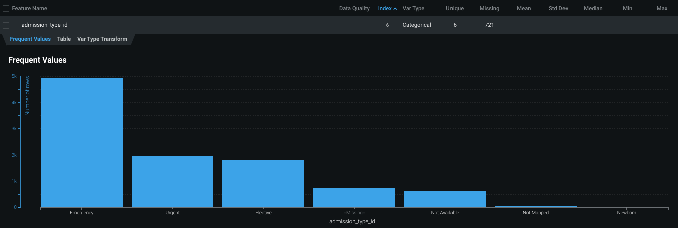
For the admission_type_id feature, the most common values are Emergency and Urgent.
View average target values
After DataRobot begins calculating EDA2, you can also view the average target values for features.
-
Under What would you like to predict, enter your target feature.
-
Click Start.
As soon as DataRobot finishes analyzing features, you can view the average target values in the Frequent Values chart.
-
In the Project Data list, select the feature you are analyzing.
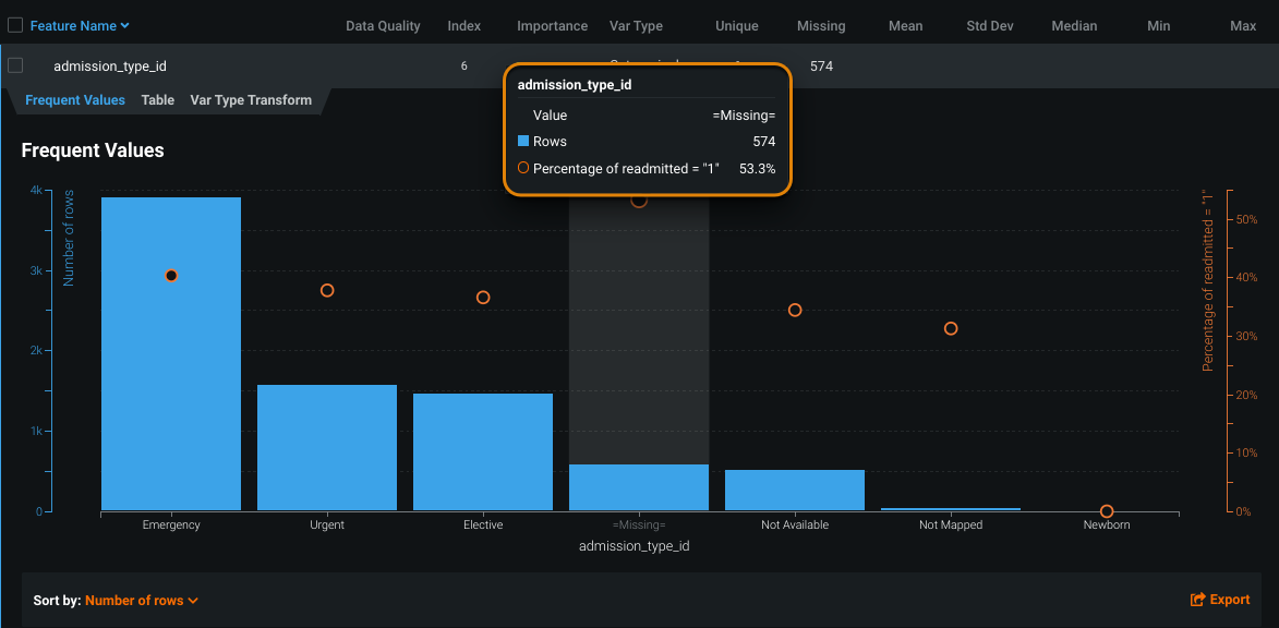
Notice the orange circles that overlay the histogram. The circles indicate the average target value for a bin.
Related reading
To learn more about the topics discussed on this page, see:
- How DataRobot performs each stage of Exploratory Data Analysis (EDA).
- How common data quality issues are detected and surfaced in the Data Quality Assessment.
- Describes the checks DataRobot runs for the potential data quality issues.