Prediction Distribution graph
The Prediction Distribution graph (on the ROC Curve tab) illustrates the distribution of actual values in relation to the display threshold (a dividing line for interpreting results).
To use the Prediction Distribution graph:
-
Select a model on the Leaderboard and navigate to Evaluate > ROC Curve.
-
Select a data source and set the display threshold. The Prediction Distribution graph updates, showing the display threshold line.
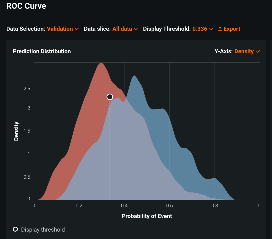
Every prediction to the left of the dividing line is classified as "false" and every prediction to the right of the dividing line is classified as "true."
The Prediction Distribution graph visually expresses model performance for the selected data source. Based on Classification use case 2, this Prediction Distribution graph shows the predicted probabilities for the two groups of patients (readmitted and not readmitted), illustrating how well your model discriminates between them. The colors correspond to the rows of the confusion matrix—red represents patients not readmitted, blue represents readmitted patients. You can see that both red and blue fall on either side of the display threshold.
-
Interpret the graph using this table:
Color on graph Location State red left of the threshold true negative (TN) blue left of the threshold false negative (FN) red right of the threshold false positive (FP) blue right of the threshold true positive (TP) Note that the gray represents the overlap of red and blue.
With a classification problem, each prediction corresponds to a single observation (readmitted or not, in this example). The Prediction Distribution graph shows the overall distribution of the predictions for all observations in the selected data source.
-
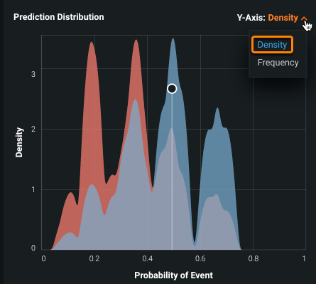
Select one of the following from the Y-Axis dropdown. The Y-Axis distribution selector allows you to choose between showing the Prediction Distribution graph as a density or frequency curve:
The chart displays an equal area underneath both the positive and negative curves.
The area underneath each curve varies and is determined by the number of observations in each class.
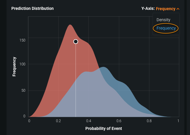
The distribution curves are based on the data source and/or distribution selection. Alternating between Frequency and Density changes the curves but does not change the threshold or any values in the associated page elements.
Experiment with the Prediction Distribution graph
Try the following changes and observe the results.
-
Pass your cursor over the Prediction Distribution graph. The threshold value displays in white text as you move your cursor.
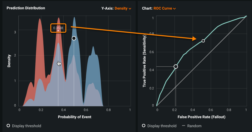
For curves displayed in the Chart pane (a ROC curve shown here), DataRobot displays a circle that dynamically moves to correspond with the threshold value.
-
Click on the Prediction Distribution graph to select a new threshold value.
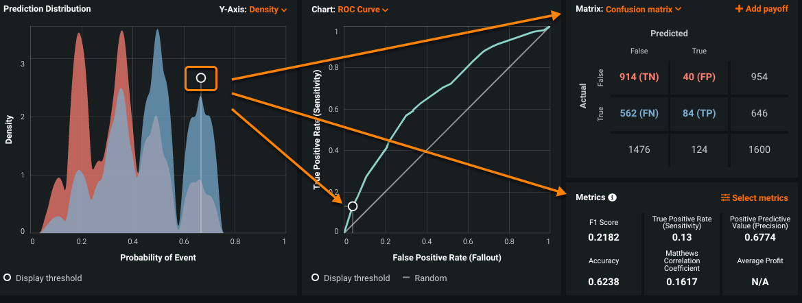
The new value appears in the Display Threshold field. The circle and intercept lines on the Prediction Distribution graph update to the new threshold value. The Metrics pane, the Chart pane (set to ROC Curve here), and the Matrix pane (set to Confusion matrix here) also update to reflect the new threshold.
Alternatively, you can change the threshold setting by typing a new value in the threshold field.
-
Click the Y-Axis dropdown to switch the prediction's distribution between displaying a Density or Frequency curve. This change does not impact other page elements.