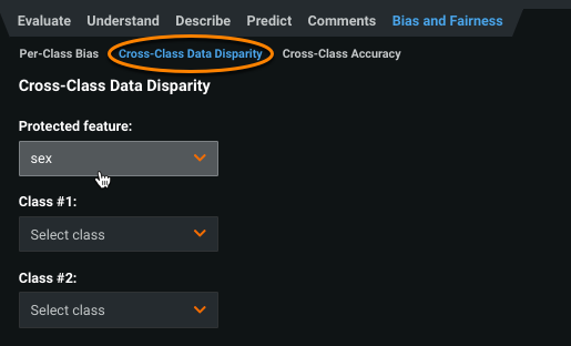
Cross-Class Data Disparity
The Cross-Class Data Disparity insight shows why the model is biased, and where in the training data it learned the bias from.
To view cross-class data disparity charts, click Cross-Class Data Disparity. Select a protected feature and two class values of that feature to measure for data disparities. The page updates to display a Data Disparity vs Feature Importance chart and a Feature details chart based on your selections. Use these charts in conjunction to perform root-cause analysis of the model's bias for the selected classes—the Data Disparity vs Feature Importance chart to identify which features in the dataset impact bias most, and the Feature details chart to investigate where the bias exists within the feature.
Data Disparity vs Feature Importance chart
The Data Disparity vs Feature Importance chart helps identify major disparities between two class values of the protected feature. The chart plots up to 100 features with the largest impact on the selected class pair of the protected feature. To change the number of features displayed, click the settings icon.
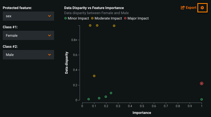
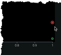
Each point on the graph represents a single feature. The placement of the point along the X-axis measures the impact of the feature, and the Y-axis measures the disparity of that feature's data distribution between the two protected classes. This value is a calculation of the Population Stability Index (PSI), a measure of difference in distribution over time.
The color of each point represents a combination of the two axes: red indicating high-importance and high-disparity features, green indicating low-disparity and low-importance features. Yellow representing everything in between.
An additional border around a point specifies the project's target feature, as seen below:
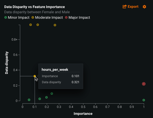
Hover on any point to view the feature name as well as the importance and data disparity calculated scores. Note that the calculated scores measure feature impact, and can also be found on the Understand > Feature Impact tab.
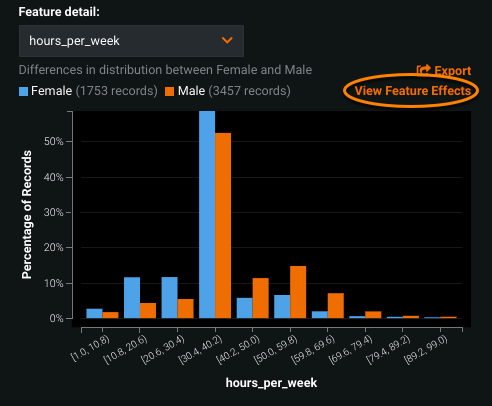
After identifying features with a major impact on the disparity between two class segments, use the Feature details chart to investigate the disparity by viewing the distribution of its values across the two classes.
Feature details chart
The Feature details chart displays a feature's value distribution across the two class segments of the protected feature. The dropdown includes the 10 features from the Data Disparity vs Feature Importance chart.
Click to select a point on the Data Disparity vs Feature Importance chart or choose a feature from the dropdown, and the Feature details chart updates to display the differences in distribution between the two class values.
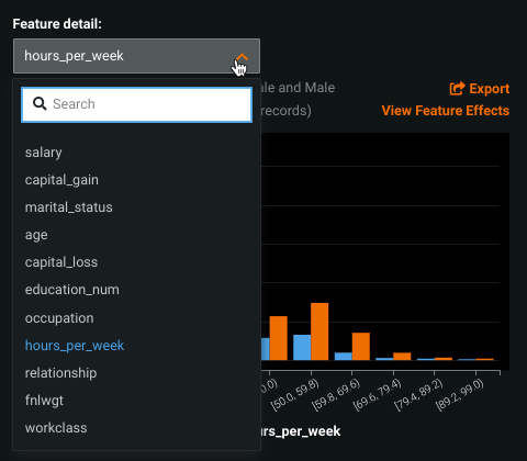
To investigate how the model interprets the relationship between each feature, click View Feature Effects to go to the Feature Effects tab.