Period Accuracy
Availability information
Period Accuracy is available for both OTV and single- and multiseries time series projects.
In some use cases, certain time periods can have more significance than others. This is particularly true for financial markets—for example, a trader may only be interested in seeing the performance of a model over the first 4 hours of each trading day. Period Accuracy gives you the ability to specify which are the more important periods within your training dataset, which DataRobot can then provide aggregate accuracy metrics for and surface those results on the Leaderboard.
Using a selected optimization (accuracy) metric, you can use the Period Accuracy insight to compare these specified periods against the metric score of the model as a whole. In the example above, seeing the RSME for the validation period of a model does not provide much insight into the model performance during the time period when it matters most to the trader.
To use the insight:
-
Choose a period definition file from the AI Catalog or your local machine. Click View file requirements for format guidance.
-
Set filters for calculating period performance.

Create a period definition file
The first step in using Period Accuracy is to create a period definition file. Similar to calendar files, the period definition file indicates the name of the periods and its start date/time (and by that, its duration). Unlike calendar files, which support ranges, the period definition file is a two-column CSV that includes:
-
Column 1: The date/time column.
This is the feature used to build the project; its label must match the name of the feature exactly. The data populating the date/time feature column should represent all the time steps you want to visualize in the insight. For example, if the project has daily data from January 30, 2022 through February 8, 2023, and you want to visualize all of that data, the first column would contain 374 entries, one per date in that range.
-
Column 2: The period column.
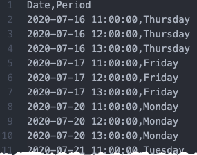
The period column represents how you would like to group the data in the insight—it represents the core of what the insight should visualize, giving more information about the accuracy of the model within the defined subset of the data, so define it based on how you want to understand your data. In the above example, you could:
-
Mark all dates in January as members of the January bucket by entering the string
Januaryin column 2 for every applicable date. Next, mark all dates in February asFebruary, etc. -
Group by weekday by labeling each Sunday with the string
Sunday, each Monday with the stringMonday, etc. -
Represent dates corresponding to Monday through Friday as the string
weekdayand the dates corresponding to Saturday and Sunday asweekend.
-
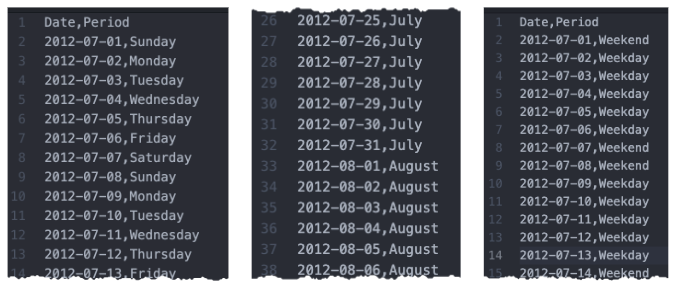
Once the period file is created, save it locally or upload it to the AI Catalog.
Time steps in a period file
Defining specific time periods within a date feature is dependent on the granularity of your data (e.g., you need hourly data to view hourly predictions). To show results that match data granularity, add multiple rows in the period file to match the times of interest. For example:
Your date/time feature is date and you have hourly data for each day. You are interested in sales between 11:00am and 1:00pm each weekday. Your period file would look like:
Generate Period Accuracy
Period Accuracy must be computed for each model in a project. However, once a period file is uploaded to one model in the project, it is available to all models. You can upload multiple period files to a project, which may be useful for examining data in different ways (for example, each day, weekday vs weekend, etc.).
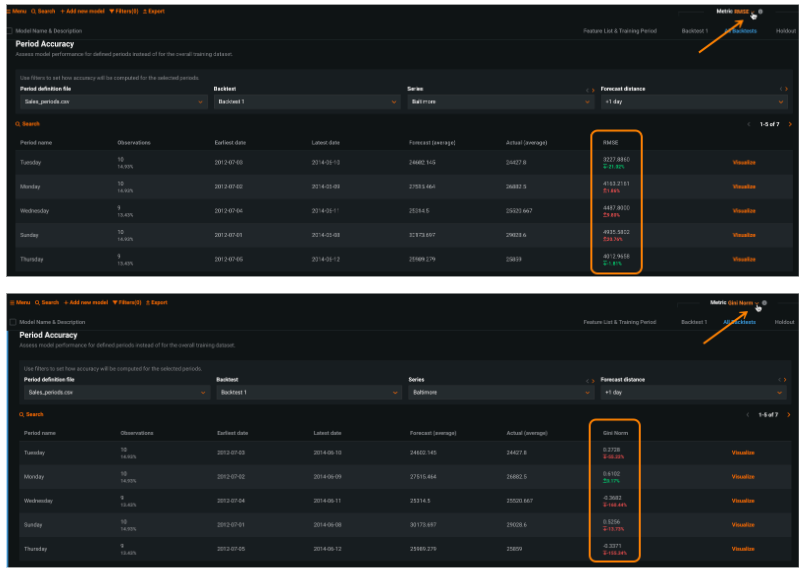
To view insights, open a model's Period Accuracy tab and, using the dropdowns, set filters for calculating period performance. Only project-applicable filters are visible.
| Filter | Description |
|---|---|
| Period definition file | Select a period definition file. From there, you can also:
|
| Backtest | Select the backtest to display results for. Although DataRobot runs all backtests when building a project, you must individually train a backtest's model and compute its validation predictions before viewing period insights for that backtest. If you select a backtest that is not yet calculated, DataRobot will prompt to run calculations. |
| Series (multiseries only) | If the project is multiseries, select a series to plot. |
| Forecast distance (time series and multiseries only) | Set the window of time to base the visualization on. See more details in Accuracy Over Time. |
Click Compute period accuracy to start calculations. Once computed, changing any filter—other than series, where applicable—requires rerunning the calculations.
Interpret Period Accuracy
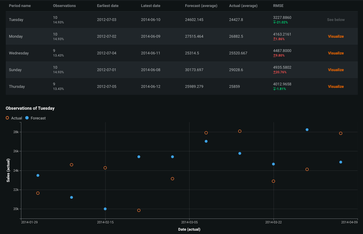
When calculations are complete, DataRobot displays a table reflecting results based on the validation data. You can also generate over time histograms.
| Field | Description |
|---|---|
| Period name | The name of the period, identified by column 2 in the period file. |
| Observations | The number of data points that fall within the defined period. The period is based on the applied period file and filters (backtest, series, and forecast distance, as applicable). |
| Earliest/latest date | The first and last timestamp found in the period. |
| Forecast/Actual | The average forecast and actual values observed in the selected backtest. |
| Metric |
The performance of the observation for the period. In other words, if you were to create a project with just this period in the validation data, the displayed value is the value that would display on the Leaderboard. The red/green values below the score indicate the percentage variance from the Leaderboard score. Note that "preferedness" of a score (red/green, up/down) is dependent on the metric type. |
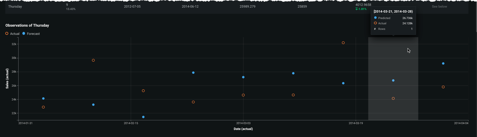
| Visualize | A link to display the Over Time chart for the selected period. Click and scroll down to see the histogram. |
* You can change the reported metric using the Leaderboard dropdown:
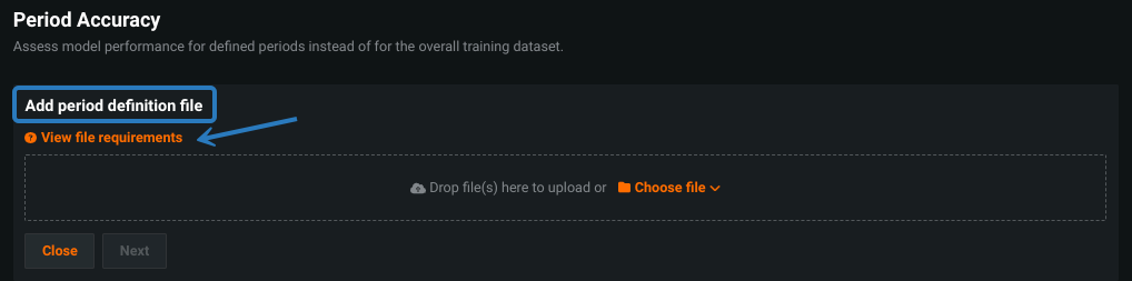
When you click Visualize, the histogram shows a point for each observation in the selected period, visualizing actual and predicted values. This helps to understand how the model performs on each row of the period of interest. Hover on a bin for specific values of member points.
Considerations
Consider the following when working with Period Accuracy:
- Only the first 1000 series are computed.
- Maximum period definition file size is 5MB. An unlimited number of period files are allowed.
- Insight export is not supported.