Accuracy
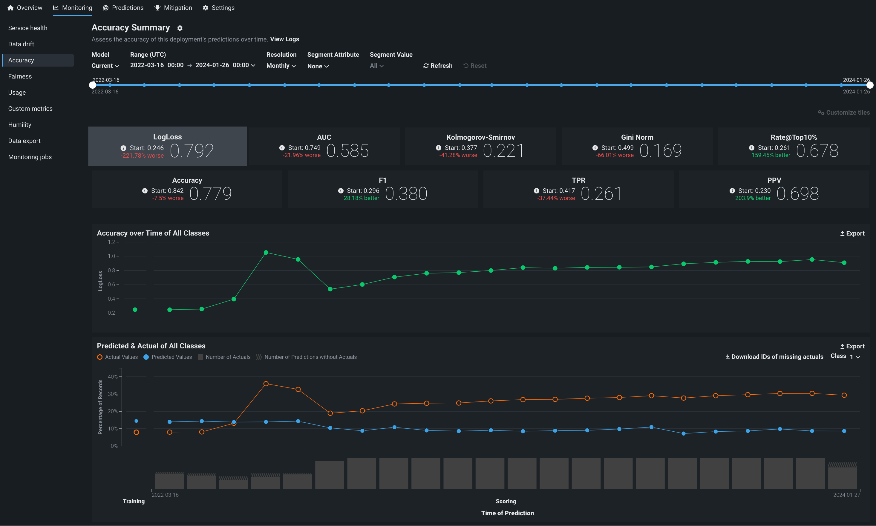
The Accuracy tab allows you to analyze the performance of model deployments over time using standard statistical measures and exportable visualizations. Use this tool to determine whether a model's quality is decaying and if you should consider replacing it. The Monitoring > Accuracy tab renders insights based on the problem type and its associated optimization metrics.
Note
The accuracy scores displayed on this tab are estimates and may differ from accuracy scores computed using every prediction row in the raw data. This is due to hourly data processing limits. Within the hourly limit, DataRobot cannot compute accuracy scores using more than 100,000 rows and instead provides scores based on the rows it was able to compute for accuracy. To achieve a more precise accuracy score, span prediction requests across multiple hours to avoid reaching the hourly computation limit.
Enable the Accuracy tab
The Accuracy tab is not enabled for deployments by default. To enable it, enable target monitoring, set an association ID, and upload the data that contains predicted and actual values for the deployment collected outside of DataRobot. Reference the overview of setting up accuracy for deployments by adding actuals for more information.
The following errors can prevent accuracy analysis:
| Problem | Resolution |
|---|---|
| Disabled target monitoring setting | Enable target monitoring on the Settings > Data drift tab. A message appears on the Accuracy tab to remind you to enable target monitoring. |
| Missing Association ID at prediction time | Set an association ID before making predictions to include those predictions in accuracy tracking. |
| Missing actuals | Add actuals on the Settings > Accuracy tab. |
| Insufficient predictions to enable accuracy analysis | Add more actuals on the Settings > Accuracy tab. A minimum of 100 rows of predictions with corresponding actual values are required to enable the Accuracy tab. |
| Missing data for the selected time range | Ensure predicted and actual values match the selected time range to view accuracy metrics for that range. |
Configure the Accuracy dashboard
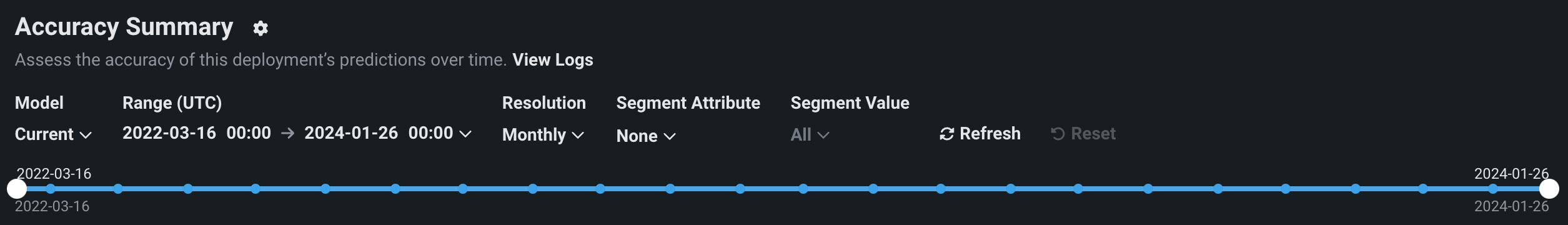
The controls—model version and data time range selectors—work the same as those available on the Data drift tab. The Accuracy tab also supports segmented analysis, allowing you to view accuracy for individual segment attributes and values.
Note
To receive email notifications on accuracy status, configure notifications and configure accuracy monitoring.
Configure accuracy metrics
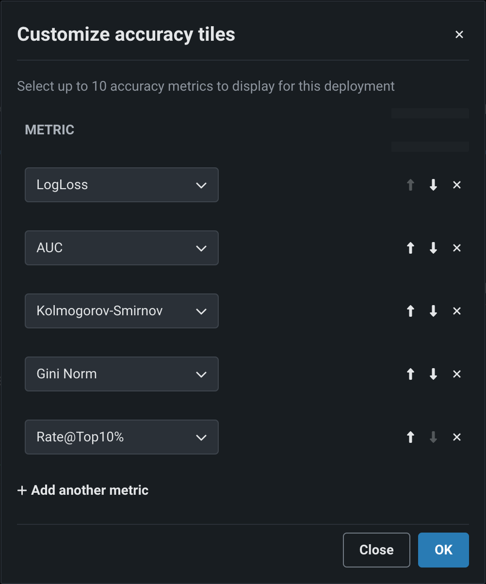
Deployment owners can configure multiple accuracy metrics for each deployment. The accuracy metrics a deployment uses appear as individual tiles above the accuracy charts. Click Customize tiles to edit the metrics used:
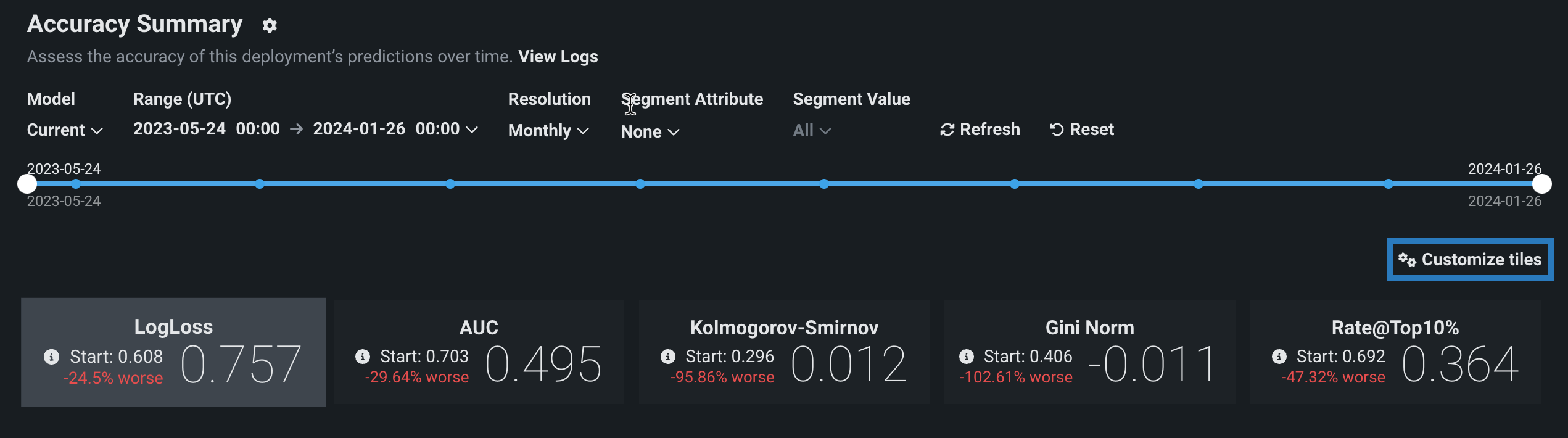
The dialog box lists all of the metrics currently enabled for the deployment, listed from top to bottom in order of their appearance as tiles, from left to right. The first metric, the default metric, loads when you open the page.
| Icon | Action | Description |
|---|---|---|
| Move metric up | Move the metric to the left (or up) in the metric grid. | |
| Move metric down | Move the metric to the right (or down) in the metric grid. | |
| Remove metric | Remove the metric from the metric grid. | |
| Add another metric | Add a new metric to the end of the metric list/grid. |
Each deployment can display up to 10 accuracy tiles. If you run out of metrics, change an existing tile's accuracy metric, clicking the dropdown for the metric you wish to change and selecting the metric to replace it. The metrics available depend on the type of modeling project used for the deployment: regression, binary classification, or multiclass.
| Modeling type | Available metrics |
|---|---|
| Regression | RMSE, MAE, Gamma Deviance, Tweedie Deviance, R Squared, FVE Gamma, FVE Poisson, FVE Tweedie, Poisson Deviance, MAD, MAPE, RMSLE |
| Binary classification | LogLoss, AUC, Kolmogorov-Smirnov, Gini-Norm, Rate@Top10%, Rate@Top5%, TNR, TPR, FPR, PPV, NPV, F1, MCC, Accuracy, Balanced Accuracy, FVE Binomial |
| Multiclass | LogLoss, FVE Multinomial |
Note
For more information on these metrics, see the optimization metrics documentation.
When you have made all of your changes, click OK. The Accuracy tab updates to reflect the changes made to the displayed metrics.
Analyze the accuracy charts
The Accuracy tab renders insights based on the problem type and its associated optimization metrics. In particular, the Accuracy over Time chart displays the change in the selected accuracy metric over time. The Accuracy over Time and Predicted & Actual charts are two charts in one, sharing a common x-axis, Time of Prediction.
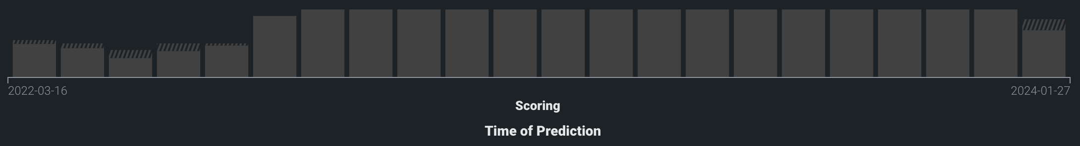
Time of Prediction
The Time of Prediction value differs between the Data drift and Accuracy tabs and the Service health tab:
-
On the Service health tab, the "time of prediction request" is always the time the prediction server received the prediction request. This method of prediction request tracking accurately represents the prediction service's health for diagnostic purposes.
-
On the Data drift and Accuracy tabs, the "time of prediction request" is, by default, the time you submitted the prediction request, which you can override with the prediction timestamp in the Prediction History and Service Health settings.
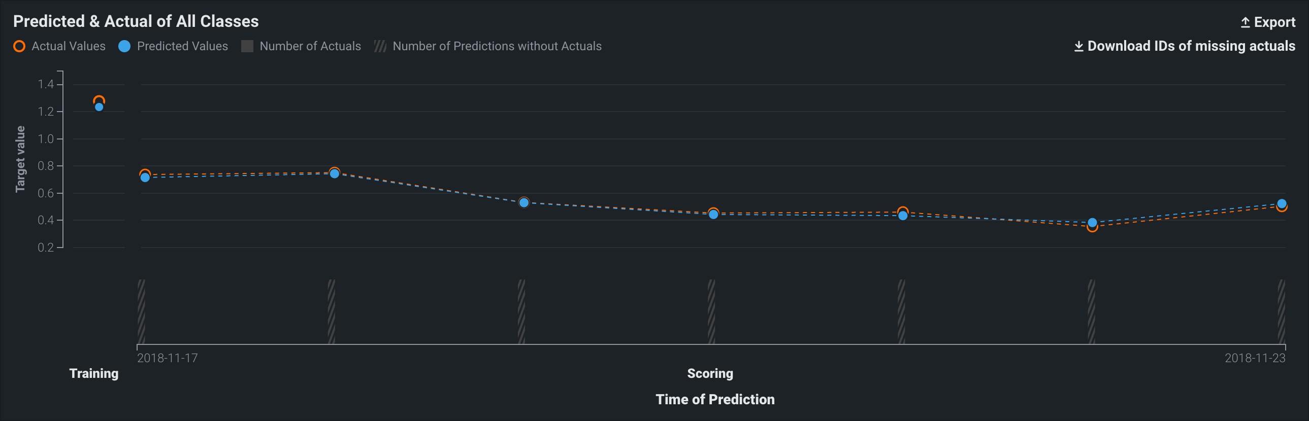
On the Time of Prediction axis (the x-axis), the volume bins display the number of actual values associated with the predictions made at each point. The light, shaded area represents the number of uploaded actuals; the striped area represents the number of predictions missing corresponding actuals:
On either chart, point to a marker (or the surrounding bin associated with the marker) on the plot to see specific details for that data point. The following table explains the information provided for both regression and classification model deployments:
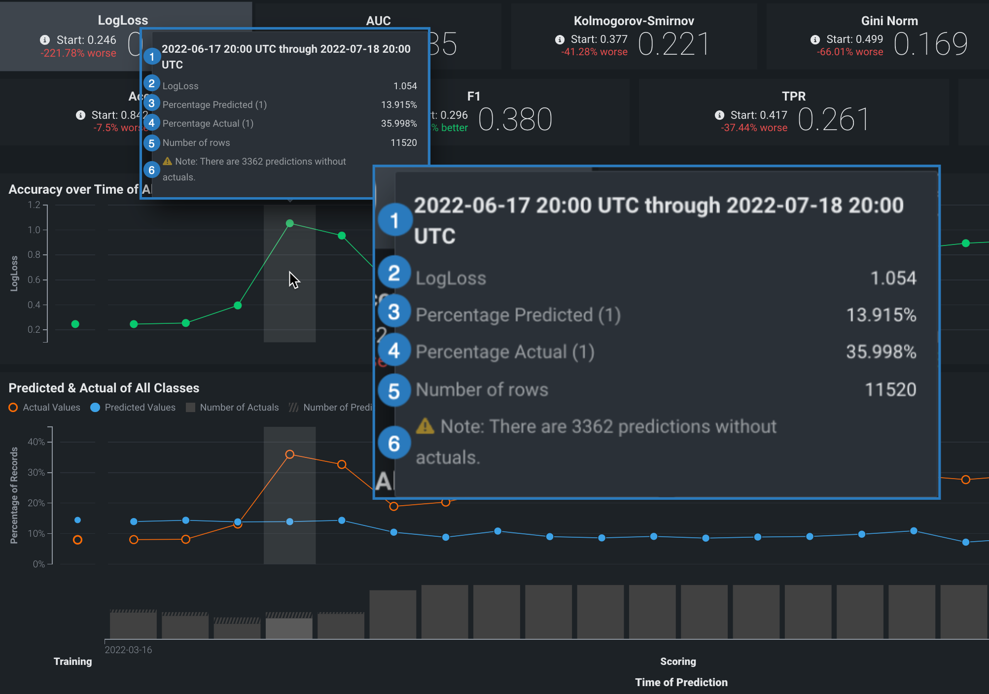
| Element | Regression | Classification |
|---|---|---|
| 1 | The period of time that the point captures. | |
| 2 | The selected optimization metric value for the point’s time period. It reflects the score of the corresponding metric tile above the chart, adjusted for the displayed time period. | |
| 3 | The average predicted value (derived from the prediction data) for the point's time period. Values are reflected by the blue points along the Predicted & Actual chart. | The frequency, as a percentage, of how often the prediction data predicted the value label (true or false) for the point’s time period. Values are represented by the blue points along the Predicted & Actual chart. See the image below for information on setting the label. |
| 4 | The average actual value (derived from the actuals data) for the point's time period. Values are reflected by the orange points along the Predicted & Actual chart. | The frequency, as a percentage, that the actual data is the value 1 (true) for the point's time period. These values are represented by the orange points along the Predicted & Actual chart. See the image below for information on setting the label. |
| 5 | The number of rows represented by this point on the chart. | |
| 6 | The number of prediction rows that do not have corresponding actual values recorded. This value is not specific to the point selected. | |
Accuracy over Time chart
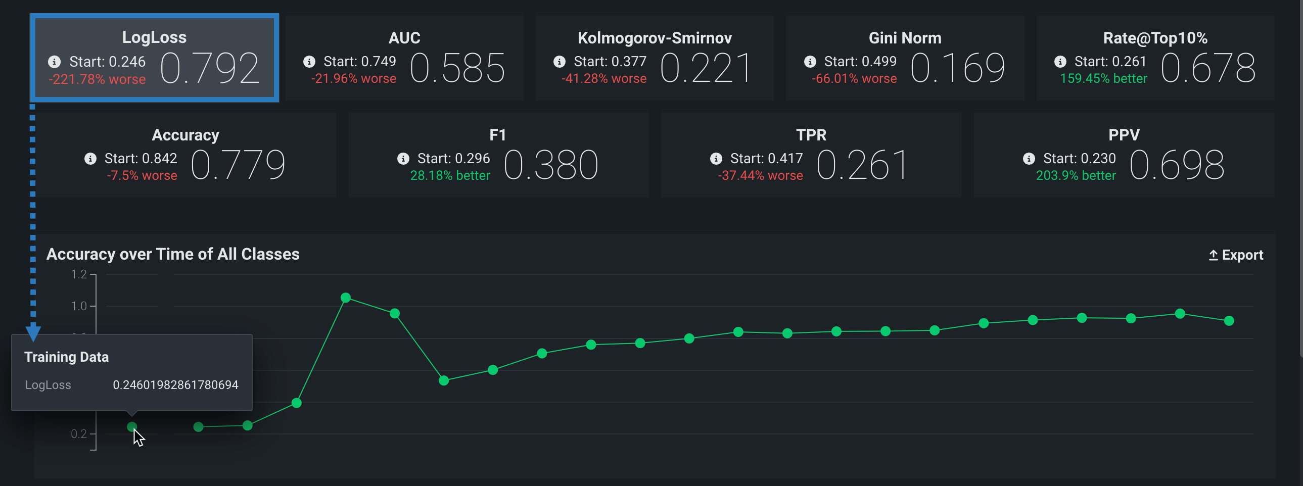
The Accuracy over Time chart displays the change over time for a selected accuracy metric value. Click on any metric tile above the chart to change the display:
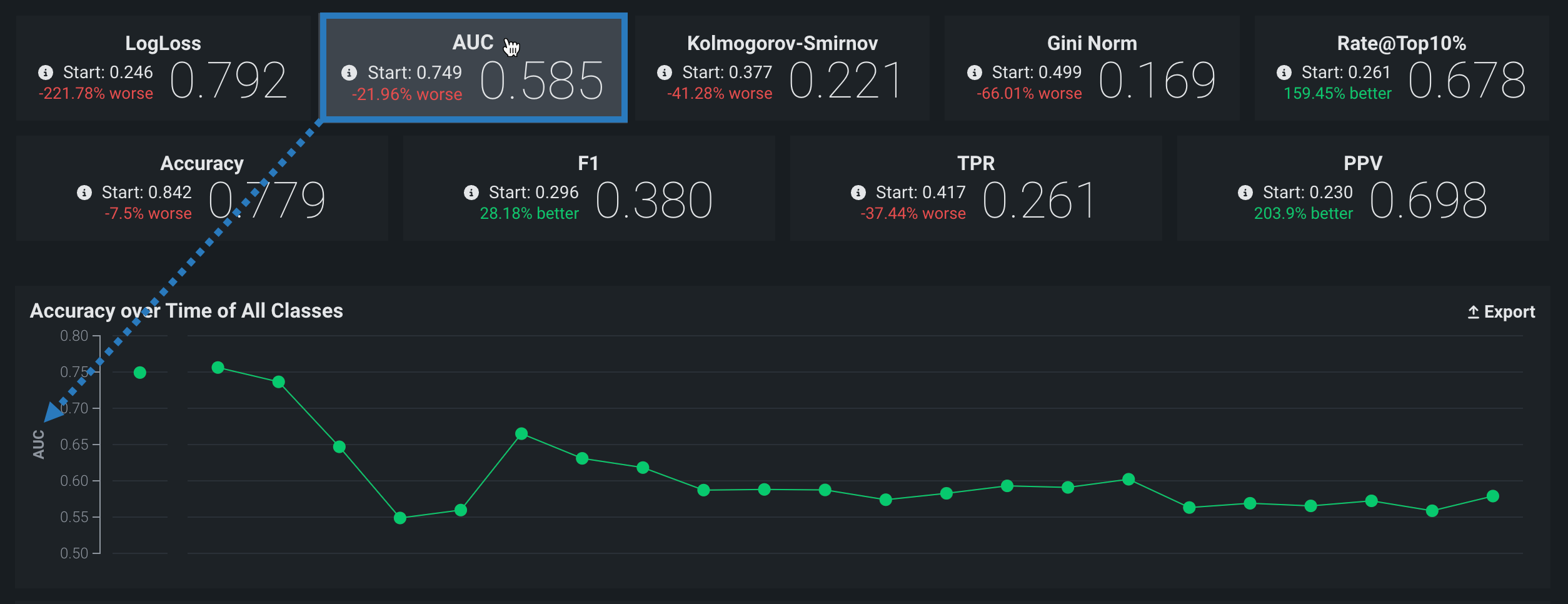
The Start value (the baseline accuracy score) and the plotted accuracy baseline represent the accuracy score for the model, calculated using the trained model’s predictions on the holdout partition:
Holdout partition for custom models
- For structured custom models, you define the holdout partition based on the partition column in the training dataset. You can specify the partition column while adding training data.
- For unstructured custom models and external models, you provide separate training and holdout datasets.
Predicted & Actual chart
The Predicted & Actual chart shows the predicted and actual values over time. For binary classification projects, you can select which classification value to show (True or False in this example) from the dropdown menu at the top of the chart:
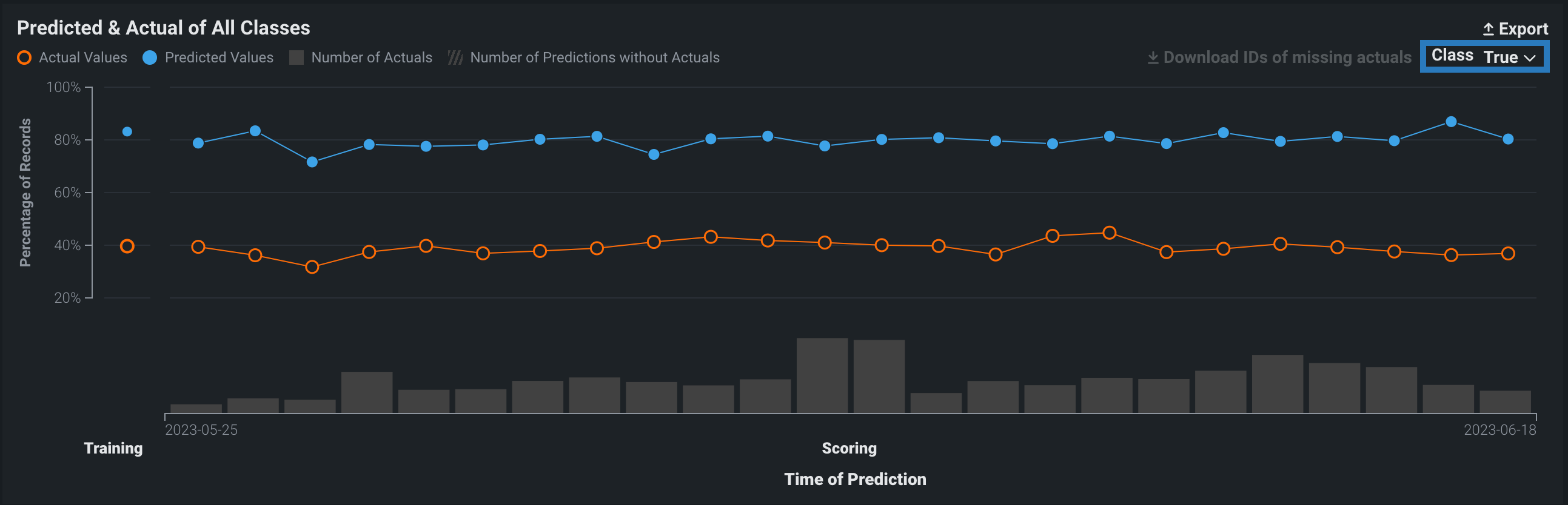
To identify predictions that are missing actuals, click the Download IDs of missing actuals link. This prompts the download of a CSV file (missing_actuals.csv) that lists the predictions made that are missing actuals, along with the association ID of each prediction. Use the association IDs to upload the actuals with matching IDs.
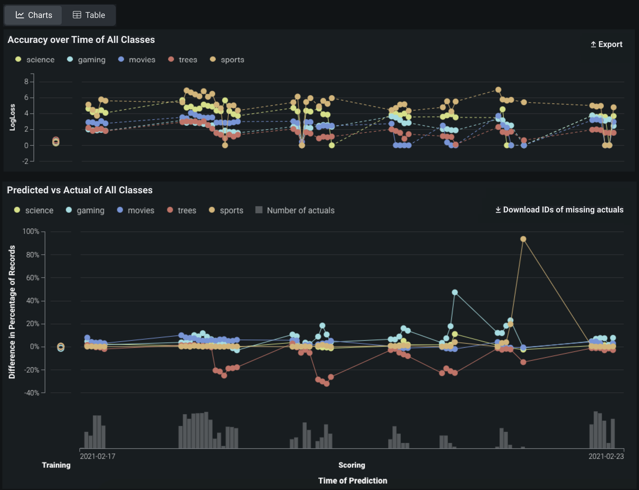
Multiclass accuracy charts
Multiclass deployments provide the same Accuracy over Time and Predicted vs Actual charts as standard deployments; however, the charts differ slightly as they include individual classes and offer class-based configuration to define the data displayed. In addition, you can choose between viewing the data as Charts or a Table:
Note
By default, the charts display the five most common classes in the training data; if the number of classes exceeds five, all other classes are represented by a single line.
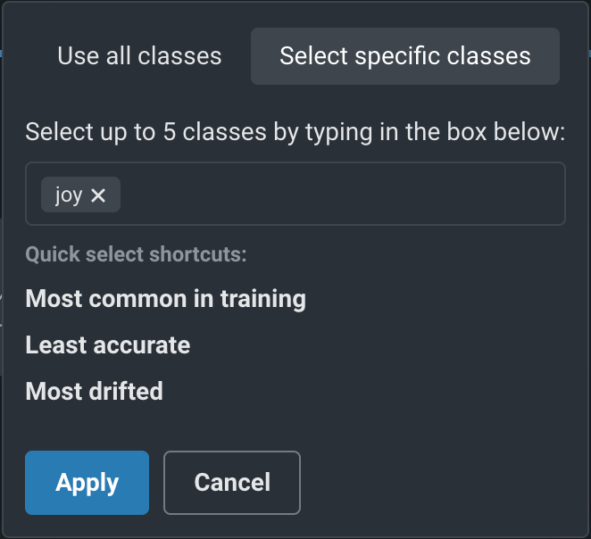
To configure the classes displayed, above the date slider, configure the Target Class dropdown, controlling which classes are selected to display on the selected tab:
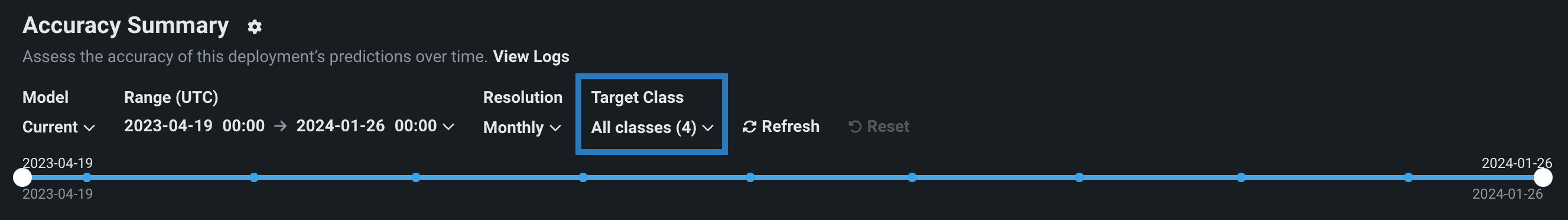
Click the dropdown to determine which classes you want to display, then select one of the following:
| Option | Description |
|---|---|
| Use all classes | Selects all five of the most common classes in the training data, along with a single line representing all other classes. |
| Select specific classes | Do either of the following to display up to five classes:
|
After you click Apply, the charts on the tab update to display the selected classes.
Interpret accuracy alerts
DataRobot uses the optimization metric tile selected for deployment as the accuracy score to create an alert status. Interpret the alert statuses as follows:
| Color | Accuracy | Action |
|---|---|---|
| Accuracy is similar to when the model was deployed. | No action needed. | |
| Accuracy has declined since the model was deployed. | Concerns found but no immediate action needed; monitor. | |
| Accuracy has severely declined since the model was deployed. | Immediate action needed. | |
| No accuracy data is available. Insufficient predictions made (min. 100 required) | Make predictions. |