Analyze features using histograms
DataRobot generates a histogram for each numeric feature so that you can analyze the distribution of the feature's values and view outlier values. This page describes how to analyze numeric features using histograms.
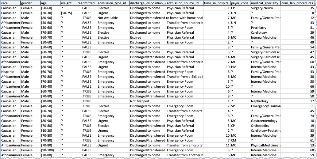
The sample dataset illustrated below contains patient data. With a goal to predict the likelihood of a patient's readmission to the hospital, use the target feature is readmitted.
Set feature distribution
DataRobot breaks the data into several bins; the size of the bin depends on the number of rows in your dataset. You can change the number of bins to change the distribution range. The bin options depend largely on the number of unique values in the dataset. To change the distribution range use the dropdown.
For classification projects, you can also (after EDA2) change the basis of the display to fill bins based on the number of rows or percentage of target value. The displays of the histogram and average target value overlay also change to match your selection.
For numeric features, use the histogram to view a rough distribution of values:
-
After importing your dataset, navigate to the Project Data list and select a feature.
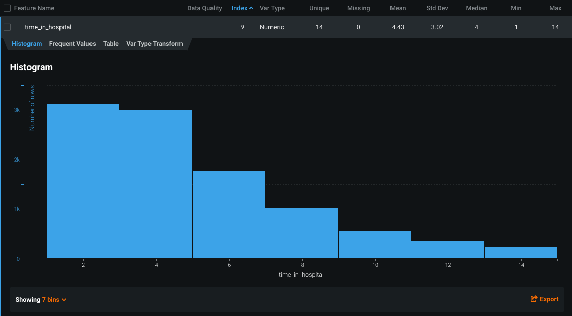
For numeric features, the histogram displays equal-sized ranges (bins). The height of each bar represents the number of rows with values in that range.
-
Hover over a bin to view the range and the number of rows that fall within the range.
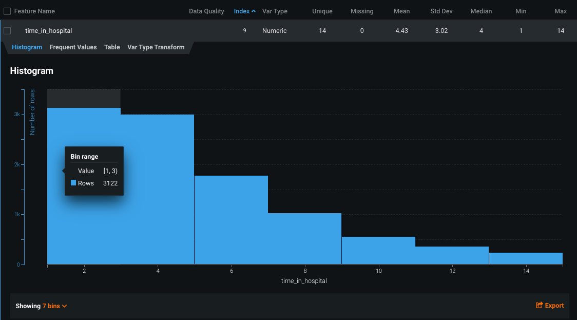
The
time_in_hospitalfeature is the number of days spent in the hospital. The histogram indicates that a visit of one to three days is most common. -
Click the Showing dropdown menu on the bottom left to change the number of bins.
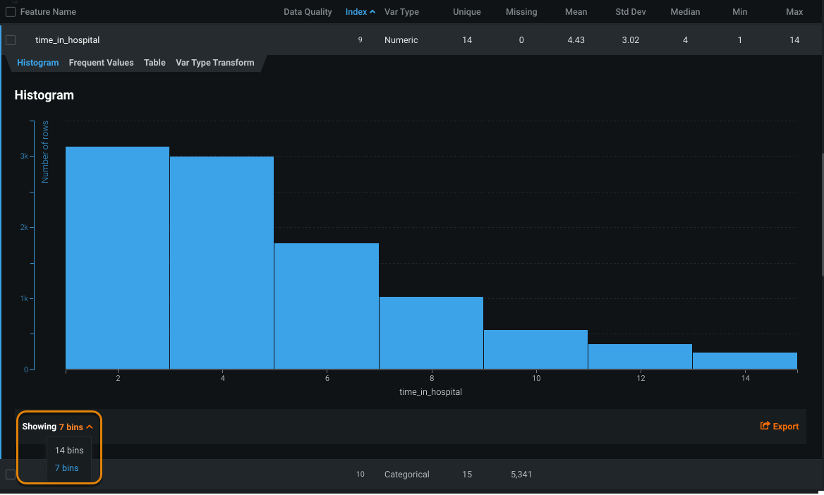
When viewing the additional bins, a visit of two to three days is most common.
Calculate outliers
Use the histogram to investigate a feature that has outlier values.
-
Select a feature that has outliers if one exists in your feature list.
Locate outlier features
Use the Data Quality Assessment tool to locate features with outliers. If a feature has outliers, a warning icon (
 ) displays in the Data Quality column. The warning tip indicates the type of issue.
 -
In the histogram that displays, toggle Show outliers on.
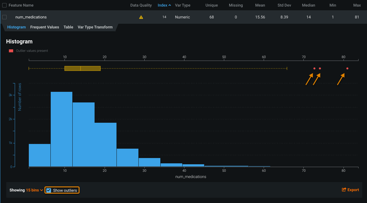
The red dots at the top of the histogram represent outlier values. The gold box plot shows the middle quartiles for the data to help you determine whether the distribution is skewed.
Note
DataRobot reshuffles the bin values based on the display. With outliers excluded, there are more bins and each contains a smaller number of rows. When toggled on, each bin contains a greater number of rows because the bin has expanded its range of values.
The bin selection dropdown works as usual, regardless of the outlier display setting.
-
Hover over a red dot to view the value of the outlier.

In this example, the outlier shown for the
num_medicationsfeature is 74.1—far from the median of 14.
View average target values
After DataRobot begins calculating EDA2, you can also view the average target values for features.
In the histogram, the orange circles indicate the average target value for a bin. In this example, hospital visits of 8 days result in the highest average target value— for 8-day visits, 46.12% of rows have readmitted = 1.
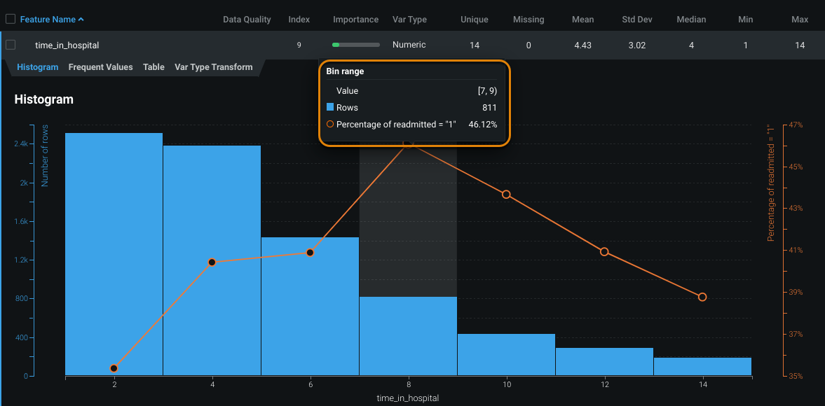
The table below describes the information included in the bin range summary:
| Element | Description |
|---|---|
| Value | Displays the bin range located on the X-axis. |
| Rows | Displays the number of rows in the bin (located on the left Y-axis). |
| Percentage | Displays the average target value (located on the right Y-axis). |
Related reading
To learn more about the topics discussed on this page, see:
- How the histogram chart is generated.
- How DataRobot performs each stage of Exploratory Data Analysis (EDA).
- How common data quality issues are detected and surfaced in the Data Quality Assessment.
- Checks DataRobot runs for the potential data quality issues.